The Challenges Of Communicating Data On The COVID-19 Pandemic

Posted on: Friday May 1st 2020
Article by: David Jamieson
Never in the history of pandemics has so much data been available to professional data scientists or the general public to track the progression of a disease. And as better ways to illustrate the COVID-19 data emerge, the charts and graphics we are seeing to describe it are themselves evolving with the shape and scale of the pandemic over time. This rapid proliferation of information and data depictions threatens to overwhelm the average observer. How are we to make sense of it all and determine which sources to trust?
We should be evidence-based and clear-headed in this time of distress, and in the spirit of critical thinking and transparency, ask, “Are all the various data depictions of COVID-19 we’re seeing useful and informative? Are some misleading or inaccurate? Why does each seem to be issued with so many caveats attached?”
Moreover, is there a chart (or charts) that tells the story most clearly and accurately, a graphic best practice? How do we decide what this would be? Like others, I have personal preferences (revealed below), and I have wondered why they speak to me more than other infographics. Do they just happen to suit my visual taste, or do they have objective properties that let them communicate better?
To help answer some of these questions, and ensure we are receiving and producing information that best tells the story—i.e., promoting appropriate inference and useful interpretation of the absolute and relative numbers, emerging trends and country comparisons—it is first best to understand the nature of the data and its legitimacy at a fundamental level. Second, we should carefully choose the modes and manners of depicting those data that will best convey meaning and connect to consumers of the information.
Are all the various data depictions of COVID-19 we’re seeing useful and informative? Are some misleading or inaccurate?
The first step toward good visualization is good data
Long before we can consider epidemiological modelling and projections of the future course of the disease, we need to have faith in the basic data elements that underly them—that is, in the measures themselves. If we have confidence in them, we proceed to render them in simple or complex terms (as needed), and hopefully in accurate and compelling ways in all cases. Let’s consider briefly the criteria for good measurement that produces high-quality data in social and medical science.
No matter what kind of data you’re looking at, it’s important to ask whether the data underlying these data presentations pass muster on four fundamental measurement properties. This basic rule applies to: charts or graphics showing counts of infection cases, hospitalizations, deaths or recoveries; single-day charts, multi-day charts or cumulative aggregates; charts showing proportional or absolute numbers; and bubble charts, histograms or line graphs. The same principle applies whether or not a chart shows growth logarithmically, and it must hold firm across both time and jurisdiction. No matter what you’re trying to express, just as you can’t make a delicious meal with bad ingredients, you can’t make a clear, meaningful data visualization with shoddy data.
Let’s assume we have dynamic data aggregating to a central repository, and that the data are complete, timely and as accurate as reasonably possible (i.e., with no motivated political hanky-panky designed to misrepresent the basic data). The measures must possess the following properties:
Reliability.
As you will recall, there are various forms of reliability; but the basic idea here is to affirm that a measure measures what it measures very closely the same way every time, and by anybody doing the measurement, and whether that is repeated with consistency and fidelity around the same moment in time, or over long time intervals. If everyone counts COVID-19 cases, for example, do they do it reliably across time and location?
Validity.
As we also recall from our training, just because a measure is reliable doesn’t mean it’s valid. Validity is far more important than reliability. Here, there are also several types of validity to be satisfied; but again, the general idea is to affirm that a measure measures what it purports to measure “correctly”, that it doesn’t measure what it’s not supposed to measure, and that it’s the right measure (hopefully the best one) for the job. In the case of coronavirus, is a measure of deaths, for example (thought to be a better indicator of disease spread than positive cases, given wide variation in the coverage and accuracy of testing across time and jurisdictions), really valid if nursing home cases are not counted? Or if COVID-19 were a secondary cause of death? Or if people thought to have recovered have later retested as a positive and are recounted?
Sensitivity.
Measurements should be sensitive to difference and change, but not overly so. Measures can be very noisy at any single measurement, and perhaps oversensitive to artifacts in the temporal reporting methodology. In the case of COVID-19, data “smoothing” using rolling averages and counts may be the better method for rendering the data to suppress such noisy variation (see example below; source: Government of Canada website).
Consistency.
While consistency is related to reliability, another facet of consistency is the comparison of measurements and data collected across jurisdictions. We need to ask whether the measures are used in the same, valid way for legitimate direct comparisons to be made. Are the multi-country charts we’re seeing comparable at all if one country only counts COVID-19 hospitalization cases or deaths in its total, ignoring non-hospital cases or deaths, while other places are more inclusive in their counting? Playing on another note of consistency, how do we interpret the depictions that have big discontinuities in them through time, such as when New York State starting adding its nursing home deaths to their totals this past week; or when China suddenly changed its criterion for case classification early on in its disease journey—both resulting in big, one-time adjustments to their growth curves (at least, one time so far…)?
Most information measured in the charts we see about COVID-19, if we have critical eyes on them, fail one or more of these basic requirements for good measurement. If we look closely, we see they’re problematic in ways both subtle and extreme. How, therefore, can we validly compare countries with such different rates of testing and ways of counting cases? How can we compare their rates of disease recovery when the timing and extensiveness of their mitigations vary so widely? Should we be plotting such highly variable cross-national data on the same graphs at all?
These are difficult questions with no easy answers. We will probably have to accept that some criteria for good scientific measurement will need to be relaxed before we can proceed in more practical terms.
Data visualizations may be based on hard numbers, but the good ones tell a meaningful story
Whether or not we
should
be plotting these measured observations, barring egregious issues with the underlying data, scientists are still compelled to plot them, hoping to reduce complexity, increase learning and weave some understandable narratives from them. When we do, we should ask, “What rendering of the data best tells the story (and then define what “best” is)? What depiction provides the appropriate context? Gives the best understanding of growth and mitigation? Conveys the human responses of threat and hope? Is a compelling call to action?” I believe that data and science must communicate effectively; and the best science is always artfully executed, calibrated to human sensibilities.
So, when we move beyond the data’s fundamental validity, we see that what also matters is to depict the data appropriately so that the stories, meaning, insights and implications that emerge are within human ken, scale and understanding. This is especially needed during a time of existential threat.
For me, there is therefore one graph—though we’ll surely need more than just one to convey the complexities of this outbreak and triangulate on insights—that gives me particular insight, pause and, curiously, comfort on a human level.
A logarithmic plot that tells a clear story, and even hints at a call to action
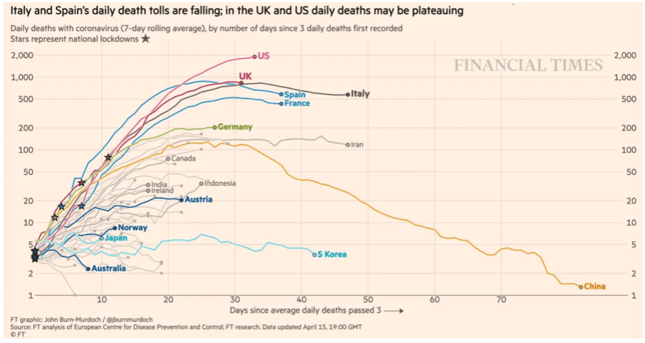
This graphic is a logarithmic plot, country by country, of the lagging indicator of ‘deaths per day’, presented in time series, and starting at a point after a certain number of deaths has been registered (the example below is from the
Financial Times
, and the start point number of ‘deaths per day’ for them is three). Just because log charts are perceived to be complex doesn’t mean they can’t tell clear stories. Here, the countries’ relative differences in level and trajectory of daily deaths can be easily compared because the data are rolling averaged for noise reduction so one can clearly see the smoothed-out paths of growth. Similar log graphs also plot vectors to indicate the rate of doubling of deaths, measured in days. Included here, those would have helped to remind us what the rate of exponential growth is, especially in the early days of a country’s experience with the disease when small differences in doubling rates carry huge implications for deaths accumulating later in time.

I find that this depiction is most useful in communicating understanding, and even motivating actions that need to happen, beginning in the exponential growth phase of the disease. This plot is a story not about flattening the familiar infection curve that we hear about so often in the media, but rather bending the daily death curve down and out of existence, and doing so as quickly as possible. That Italy, Spain, France and Iran have plateaued in this rendering is
not
good news. Iran, for example, has been registering a consistent average of 100-150 deaths from the virus for the past 25 or more days. Italy, more than 500 daily deaths for a month (despite what the title says). Only China, if we are to believe their data, has defeated the angel of COVID-19 death, taking more than 80 days of draconian interventions/mitigations to do so. It’s important to see China’s line of daily, not cumulative, deaths plotted here; and to note its deterioration to nothingness as a hopeful sign for us all. This line, way out in front of the pack, stands as an aspirational pattern among the peaks of real-world death toward which most other countries are still climbing. For me, this graphic really connects: its message lands with clarity and force.
One problem with this graph, if you don’t know how to read it, is that apparently small horizontal level differences, which are logarithmic in scale, have large outcomes in accumulated deaths (which, of course, are not shown here, unless you know how to integrate the area lying beneath a logarithmic curve). For example, while Italy and Iran are running in parallel and pretty flat now, the roughly 375 daily death difference in the plateaus on which each has levelled has meant that Italy has accumulated more than four times the number of deaths over time as Iran (approximately 22,000 vs. 5,000). The area under each of their curves, when compared visually, do not give that impression given the log scaling with which many people are unfamiliar. It is not surprising that we will need another depiction to more clearly communicate accumulated deaths.
A bigger problem, perhaps, is that the data in this chart are not presented
per capita
, so as to ground the relative risks of contracting COVID-19 in one’s local context. Viewed that way, Italy’s per capita cumulative total deaths are actually six times those of Iran, not four (approximately 365 vs. 59 deaths per million). I believe charts such as this, while scientific in nature, can and should also attempt to communicate realistic risk, assuage fears and motivate action.
The same data, scaled to show deaths relative to population size
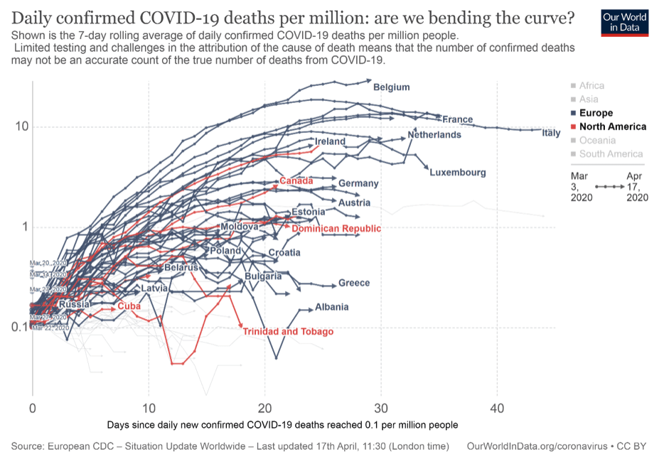
For example, little recognized is that among EU countries, Belgium is the hardest hit, per capita, at present. So, the following is the previous chart presented again, this time from another source (OurWorldInData.com), where plotting on a per capita basis highlights Belgium’s unfortunate circumstances. Note that even though Asia is not a highlighted region in this version of the chart, China does not appear at all, probably because the proviso of ‘confirmed’ has been applied in filtering the data. Its presence would have helped to show the “prescriptive pattern” noted above that could have provided a more human connection with the viewer.

Note too that Canada’s curve is now visually much closer to the U.S.’s (the unlabelled red line above Canada) in this more relativized view. Visually, this grounds us in the knowledge that our COVID-19 rates of daily death, while several times better than those in the U.S., are only showing an average level of success compared with other countries on a per capita basis. It also shows we have not yet likely succeeded, as of this writing, on bending the curve (though recall this is a lagging indicator of cases, so time will tell). This depiction is a call for Canada to stay the course, or perhaps increase its efforts to bend this curve.
A third approach to displaying death data—truthful, but less useful?
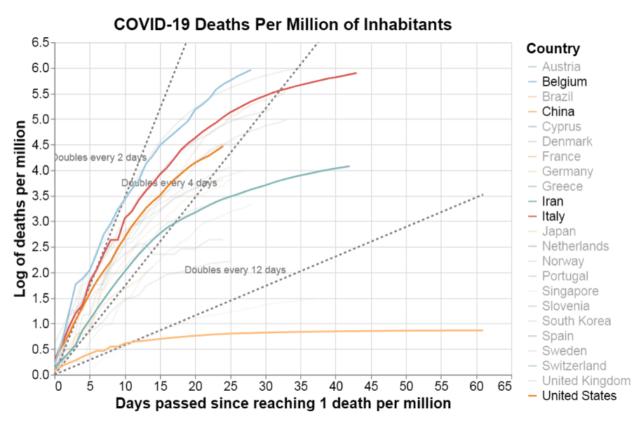
To see how these two daily deaths charts differ from plots of total deaths, consider this cumulative deaths log chart, which is also plotted on a per capita basis (source: covid19dashboards.com):

Source: https://covid19dashboards.com/covid-compare-permillion/
You can see how useful those doubling rate vectors are here (dotted lines), and that China has lost so many fewer people per capita than Belgium or other countries, given its enormous population. But I’m less compelled by this chart. Why? First, I would argue that the log transformation is confusing because it doesn’t even look ‘log-ish’ to me in the more familiar ‘faded gradient’ visual way, and thus violates expectations. Second, the chart gives little of the narrative of hopeful resolution that the first graph above offers; the curve can only go flat here in the long term; and when it does, it signals that deaths have ended at a final proportion of a country’s present population. Third, I find this logarithmic depiction actually obscures the information it should be making clear—for example, is it more useful to know the current accumulated per capita deaths in Italy in whole numbers per million or that the log of that number is 5.9, as plotted above?
Data visualizations are a form of communication—the old rules apply: know yourself, know your audience
Now, we all have our preferences for what we want or need to know, for the modalities in which we learn best, and for how we “translate” such “simple” charts into understanding and compelling narratives. The wisest way to proceed is to follow the old adage “know thyself”. Recognize how your own unconscious preferences, especially emotional ones, for making meaning out of data guide and sometimes bias you toward the depictions of visual information you choose to create or consume. And then, if you are a professional communicator, supplement this self-understanding by knowing your audience. Empathize with your readers and know them well enough to anticipate how they will best apprehend the data and extract its meaning. We will often be wiser, and sometimes more generous, producers and consumers of such information for our efforts.
Tags:
More Articles

Solutions
When Budgets Tighten, Choices Narrow: How GTA Residents Are Adapting to Rising Costs
03/26/26
Tony Coulson

Industry Trends
How Are Canadians Choosing Their Mortgage Lenders?
03/25/26
Heidi Wilson

Industry Trends
How Scene+, Shell and Blue Rewards Reveal the Future of Canadian Loyalty
03/24/26
Bernice Cheung

