The Challenges Of Communicating Data On The COVID-19 Pandemic: Finding The Right Visualization
ARTICLE
BY DAVID JAMIESON
Are all the various data depictions of COVID-19 we’re seeing useful and informative? Are some misleading or inaccurate?
I find that this depiction is most useful in communicating understanding, and even motivating actions that need to happen, beginning in the exponential growth phase of the disease. This plot is a story not about flattening the familiar infection curve that we hear about so often in the media, but rather bending the daily death curve down and out of existence, and doing so as quickly as possible. That Italy, Spain, France and Iran have plateaued in this rendering is not good news. Iran, for example, has been registering a consistent average of 100-150 deaths from the virus for the past 25 or more days. Italy, more than 500 daily deaths for a month (despite what the title says). Only China, if we are to believe their data, has defeated the angel of COVID-19 death, taking more than 80 days of draconian interventions/mitigations to do so. It’s important to see China’s line of daily, not cumulative, deaths plotted here; and to note its deterioration to nothingness as a hopeful sign for us all. This line, way out in front of the pack, stands as an aspirational pattern among the peaks of real-world death toward which most other countries are still climbing. For me, this graphic really connects: its message lands with clarity and force.
One problem with this graph, if you don’t know how to read it, is that apparently small horizontal level differences, which are logarithmic in scale, have large outcomes in accumulated deaths (which, of course, are not shown here, unless you know how to integrate the area lying beneath a logarithmic curve). For example, while Italy and Iran are running in parallel and pretty flat now, the roughly 375 daily death difference in the plateaus on which each has levelled has meant that Italy has accumulated more than four times the number of deaths over time as Iran (approximately 22,000 vs. 5,000). The area under each of their curves, when compared visually, do not give that impression given the log scaling with which many people are unfamiliar. It is not surprising that we will need another depiction to more clearly communicate accumulated deaths.
A bigger problem, perhaps, is that the data in this chart are not presented per capita, so as to ground the relative risks of contracting COVID-19 in one’s local context. Viewed that way, Italy’s per capita cumulative total deaths are actually six times those of Iran, not four (approximately 365 vs. 59 deaths per million). I believe charts such as this, while scientific in nature, can and should also attempt to communicate realistic risk, assuage fears and motivate action.
The same data, scaled to show deaths relative to population size
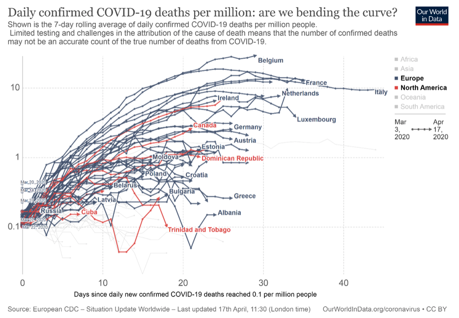
For example, little recognized is that among EU countries, Belgium is the hardest hit, per capita, at present. So, the following is the previous chart presented again, this time from another source (OurWorldInData.com), where plotting on a per capita basis highlights Belgium’s unfortunate circumstances. Note that even though Asia is not a highlighted region in this version of the chart, China does not appear at all, probably because the proviso of ‘confirmed’ has been applied in filtering the data. Its presence would have helped to show the “prescriptive pattern” noted above that could have provided a more human connection with the viewer.
Note too that Canada’s curve is now visually much closer to the U.S.’s (the unlabelled red line above Canada) in this more relativized view. Visually, this grounds us in the knowledge that our COVID-19 rates of daily death, while several times better than those in the U.S., are only showing an average level of success compared with other countries on a per capita basis. It also shows we have not yet likely succeeded, as of this writing, on bending the curve (though recall this is a lagging indicator of cases, so time will tell). This depiction is a call for Canada to stay the course, or perhaps increase its efforts to bend this curve.
A third approach to displaying death data—truthful, but less useful?
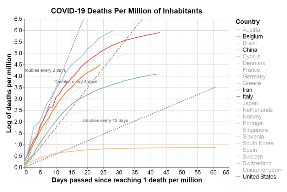
To see how these two daily deaths charts differ from plots of total deaths, consider this cumulative deaths log chart, which is also plotted on a per capita basis (source: covid19dashboards.com):
You can see how useful those doubling rate vectors are here (dotted lines), and that China has lost so many fewer people per capita than Belgium or other countries, given its enormous population. But I’m less compelled by this chart. Why? First, I would argue that the log transformation is confusing because it doesn’t even look ‘log-ish’ to me in the more familiar ‘faded gradient’ visual way, and thus violates expectations. Second, the chart gives little of the narrative of hopeful resolution that the first graph above offers; the curve can only go flat here in the long term; and when it does, it signals that deaths have ended at a final proportion of a country’s present population. Third, I find this logarithmic depiction actually obscures the information it should be making clear—for example, is it more useful to know the current accumulated per capita deaths in Italy in whole numbers per million or that the log of that number is 5.9, as plotted above?
Data visualizations are a form of communication—the old rules apply: know yourself, know your audience
Now, we all have our preferences for what we want or need to know, for the modalities in which we learn best, and for how we “translate” such “simple” charts into understanding and compelling narratives. The wisest way to proceed is to follow the old adage “know thyself”. Recognize how your own unconscious preferences, especially emotional ones, for making meaning out of data guide and sometimes bias you toward the depictions of visual information you choose to create or consume. And then, if you are a professional communicator, supplement this self-understanding by knowing your audience. Empathize with your readers and know them well enough to anticipate how they will best apprehend the data and extract its meaning. We will often be wiser, and sometimes more generous, producers and consumers of such information for our efforts.
Find out how Environics can help your organization
Related insights


Toronto
366 Adelaide Street West
Suite 101, Toronto, ON
Canada M5V 1R9
416 920 9010
Ottawa
135 Laurier Ave W.
Ottawa, ON
Canada K1P 5J2
613 230 5089
Calgary
421 7th Ave SW
Suite 3000, Calgary, AB
Canada T2P 4K9
403 613 5735


